|
|
|
Design tab | View | Toolbars | Data Tree
Summary |
In the Report Designer, there are two methods of creating data-aware components:
You might use the Data Tree if you have a large number of fields to report on, or want to automatically add default labels to data components. |
Using the Data Tree |
The Data Tree has two tabs:
|
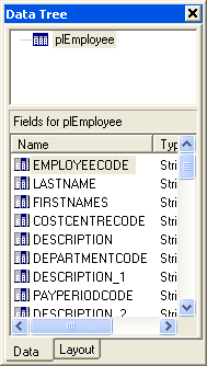
Data tab |
The top section of the Data tab lists the data pipelines that the report has access to. The bottom section lists all of the fields for the currently selected data pipeline. You can select fields here and drag them to any part of the report layout. The data-aware component that is appropriate for the field will be created, along with a label and border.
|
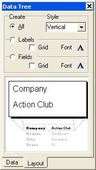
Layout tab |
The Layout tab allows you to control the behaviour of drag-and-drop. By default, a label and border are created for each data-aware component. From this tab you can turn off the label or border, and control their colour and the font of the label and data-aware component. When you have set the drag-and-drop behaviour, it will be retained for future design sessions.
|
|
|
|